In this study, I used a data-driven approach based on objective machine-learning methods to identify distinct patterns that best characterize the data and enable examination of the patterns’ predictive power. Specifically, I used various unsupervised machine-learning methods to cluster the time-series data into separable classes. To my surprise, all methods unanimously agree that simple harmonic functions best characterize the data. I also find that further filtering the data by time, sector, or profitability doesn’t add predictive power to the clusters.
Further exploration of the data is still needed. In the future, I would like to examine the multi-scale nature of the problem as well as expand the study to include more clusters in the unsupervised analysis.
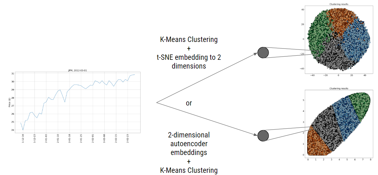
Figure 1: Time series embedded into 2 dimensions--results visualized as clusters
In this study, I used a data-driven approach based on objective machine-learning methods to identify distinct patterns that best characterize the data and enable examination of the patterns’ predictive power. Specifically, I used various unsupervised machine-learning methods to cluster the time-series data into separable classes. To my surprise, all methods unanimously agree that simple harmonic functions best characterize the data. I also find that further filtering the data by time, sector, or profitability doesn’t add predictive power to the clusters
My name is Lawrence Huang, and I’m a rising senior at Carnegie Mellon studying Physics. I am also a Prep for Prep alum, which is a leadership development program that offers promising students of color access to private school education.
This summer I worked as an intern for J.P. Morgan’s AI Research team. Due to coronavirus, this internship was shortened to five weeks and was fully remote. Considering the short duration of the internship, there are many related avenues of inquiry to explore.
Background & Related Work
Technical analysis in trading aims to evaluate investments and identify opportunities using only price and volume data. It isn’t immediately obvious why this type of analysis in trading may have predictive value, especially when compared with fundamental analysis. Fundamental analysis looks at a company’s financial reports, state of the economy, and industry trends to determine whether the “true” or assessed value of a stock reflects its current traded value. If the current price is below the assessed price we predict, the stock price will increase, and vice versa if the assessed price is lower than the current price. On the other hand, in a technical analysis view, all known fundamentals of a company’s business are instantaneously factored into the stock price. Thus, there is no need to explore the economic conditions of a company – it’s already reflected in the price. The price is all that matters!
Predictions, for the technical analyst, are made by identifying patterns that are “known” to lead to a predetermined outcome. A few well-known chart patterns are the head and shoulders, triangle, double top, etc. These are general shapes that stock prices can take, and technical analysts have found these shapes to be useful in making predictions in trading. For example, the head and shoulders is a reversal sign, indicating a bull to bear trend. However, complexity exists for the technical analyst in making related predictions because typically there are multiple signs in a given time series. For example, the pattern may be 70% head and shoulders, and 20% channel up.
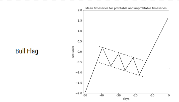
Relying on known patterns then, can enter subjectivity into technical analysis. However, a body of research supports the idea that leveraging chart patterns in technical analysis has useful predictive value. For example, for a bull flag chart pattern, two separate papers studied methods of pattern matching and quantifying how well a given stock chart matches the bull flag chart pattern. The first of these papers, published in 2002, identified trading rules based on how well the stock chart matched a bull flag and found these trading rules to be effective on out-of-sample examples (Leigh, William, et al. "Stock market trading rule discovery using technical charting heuristics." Expert Systems with Applications 23.2 (2002): 155-159.).
Figure 2: Example of a bull flag pattern
The second, published in 2007, focuses on two stock market indices - Nasdaq Composite Index (NASDAQ) and Taiwan Weighted Index (TWI). This second study found that technical trading rules correctly predict the direction of market changes. It also found that matches with the bull flag pattern were correlated with higher returns (Wang, Jar-Long, and Shu-Hui Chan. "Stock market trading rule discovery using pattern recognition and technical analysis." Expert Systems with Applications 33.2 (2007): 304-315.). In considering the bull flag chart pattern alone then, these two separate research papers find that one can make a profit, on average, by leveraging chart patterns.
The second, published in 2007, focuses on two stock market indices - Nasdaq Composite Index (NASDAQ) and Taiwan Weighted Index (TWI). This second study found that technical trading rules correctly predict the direction of market changes. It also found that matches with the bull flag pattern were correlated with higher returns (Wang, Jar-Long, and Shu-Hui Chan. "Stock market trading rule discovery using pattern recognition and technical analysis." Expert Systems with Applications 33.2 (2007): 304-315.).
In considering the bull flag chart pattern alone then, these two separate research papers find that one can make a profit, on average, by leveraging chart patterns.
For a more thorough overview of technical analysis chart patterns, I highly recommend a paper by Andrew W. Lo, Harry Mamaysky, and Jiang Wang, Foundations of Technical Analysis: Computational Algorithms, Statistical Inference, and Empirical Implementation. In this paper, the researchers examine ten different chart patterns in-depth, and how to recognize the patterns quantitatively.
Still, it remains that most of the research on technical analysis chart patterns address either the evaluation of their usefulness in trading or the application of new technologies to recognize chart patterns.
Research Question and Approach
This project reflects my research during my 5-week internship at JP Morgan with the AI Research team. Rather than focusing on existing chart patterns, I focused on identifying if I could extract some meaning out of any resulting patterns. I was interested in researching the following questions:
- Can we identify patterns in stock time series using unsupervised learning?
- Will we find patterns similar to chart patterns?
- Will we find patterns that are good indicators of potential profit/loss?
I used a data-driven approach to observe whether such patterns actually exist in the data. Specifically, I used from Yahoo finance daily equity data of companies that contribute to the S&P 500 index (e.g., JPM, Google, Amazon, etc.) but limit the data to the last 30 years (1990-2020).
The data spanned approximately 30 years for each company. I wanted to identify patterns in short, sequential time segments. After some exploration, I chose 50 days as the length of the time-series segments. My main concern regarding the time-series length was the potential difficulty in finding meaningful patterns if segments were too short. While 50 trading days is not very long, my expectation was that this duration would be conducive to obtaining both predictive value and distinguishable patterns. Still, looking forward it would be interesting to do a deeper exploration and identify patterns that may emerge on a longer or variable time scale.
To mine for consistent patterns in the time-series segments, I needed to collect many such segments. I used the bootstrap method and randomly sampled (with replacement) 50,000 chunks of 50 days from the data. After sampling, I used one of several clustering methods: K-Means, DBSCAN, Hierarchical Clustering, or K-Means on an autoencoder-encoded time series to separate the segments to distinguishable patterns.
The goal of the project was to examine the characteristics that distinguish the clusters. In particular, I was looking for cluster centers that appeared similar to existing chart patterns, as well as clusters that had a higher future potential profit/loss on average than other clusters.
Results
In this section, I show the result of my clustering exercise using various methods and segment length. In addition, I explore the characteristics of the resulting segments.
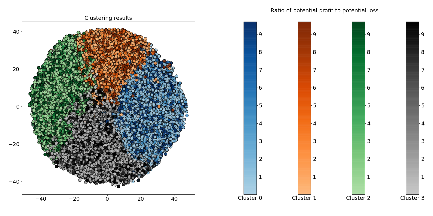
In Figure 3, I depict the result of separating the segments using the K-Means algorithm. In that figure, each point represents a 50-day segment that has been embedded onto a two-dimensional space using t-SNE embedding. The goal here is to quantitatively ensure that the clusters are well-separated, and explore, preliminarily, if any of the clusters are distinguishable as representing profitability.
I examined the learning curve of the within-cluster sum of squares as a function of the number of clusters for a range of numbers (up to 20). Then I chose to use four clusters using the elbow method. It is essential to explore a greater number of clusters as this increases the opportunity to learn more complex patterns – particularly patterns that are used in practice.
In Figure 3, I also represent each cluster with a different colormap. The scale corresponds to the ratio of potential profit to potential loss. That is, the darker the color, the more profitable the time series. We define potential profit as the amount of profit made by investing $100 at the end of the time series and selling at the maximum price in 20 days. The counterpart, potential loss, is defined as the amount lost when investing $100 and selling at the lowest point in 20 days.
Unfortunately, we don’t see any clusters that emerge as particularly profitable or unprofitable. So, we continue investigating what exactly each cluster means.
Figure 3: Cluster results for K-Means, where hue is determined by the ratio of potential profit to potential loss
In Figure 3, I also represent each cluster with a different colormap. The scale corresponds to the ratio of potential profit to potential loss. That is, the darker the color, the more profitable the time series. We define potential profit as the amount of profit made by investing $100 at the end of the time series and selling at the maximum price in 20 days. The counterpart, potential loss, is defined as the amount lost when investing $100 and selling at the lowest point in 20 days.
Figure 4: Bar charts of cluster makeup by week, month, and year
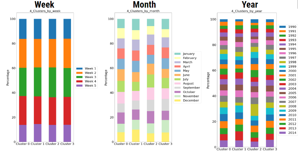
After checking whether or not clusters correlate with profit, we check whether clusters correlate with the date. Specifically, the year, month, and the week of the month. However, as Figure 4 reveals, we see similar profiles throughout. Our clusters don’t seem to be grouping by time or by profit.
After checking whether or not clusters correlate with profit, we check whether clusters correlate with the date. Specifically, the year, month, and the week of the month. However, as Figure 4 reveals, we see similar profiles throughout. Our clusters don’t seem to be grouping by time or by profit.
Figure 5: Bar charts of cluster makeup by sector
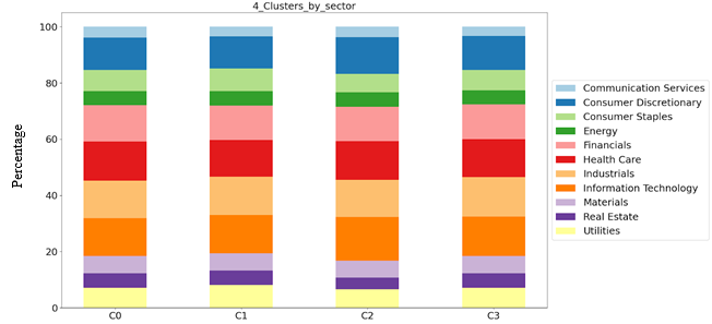
Figure 5 explores the correlation of the various groups with the various sectors. As in Figures 3-4, qualitatively, we can’t find any distinguishable difference between the various sectors in Figure 5. Since clustering reveals no obvious correlation with any of our metadata, we hypothesize the clustering correlates with patterns in the data. What exactly is a pattern, and what does it look like? Examples of patterns used in technical analysis are seen in Figure 6. Note that these patterns are not unique and small variations still count as the same pattern. More importantly, these patterns exhibit oscillatory behavior as can be seen in Figure 6b.
Figure 5 explores the correlation of the various groups with the various sectors. As in Figures 3-4, qualitatively, we can’t find any distinguishable difference between the various sectors in Figure 5. Since clustering reveals no obvious correlation with any of our metadata, we hypothesize the clustering correlates with patterns in the data.What exactly is a pattern, and what does it look like?
Examples of patterns used in technical analysis are seen in Figure 6. Note that these patterns are not unique and small variations still count as the same pattern. More importantly, these patterns exhibit oscillatory behavior as can be seen in Figure 6b.
Figure 6a: Example of Head and Shoulders pattern
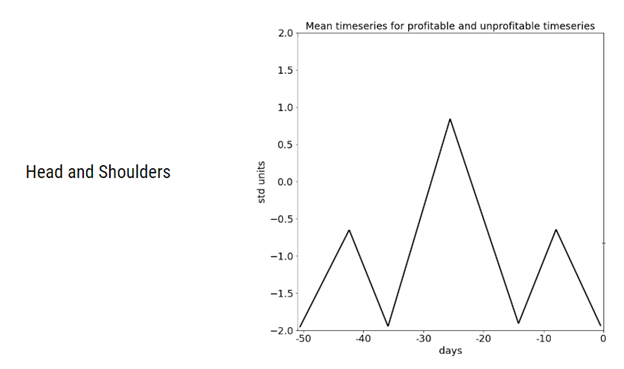
What exactly is a pattern, and what does it look like? Examples of patterns used in technical analysis are seen in Figure 6. Note that these patterns are not unique and small variations still count as the same pattern. More importantly, these patterns exhibit oscillatory behavior as can be seen in Figure 6b.
Figure 6b: Example of Triangle pattern
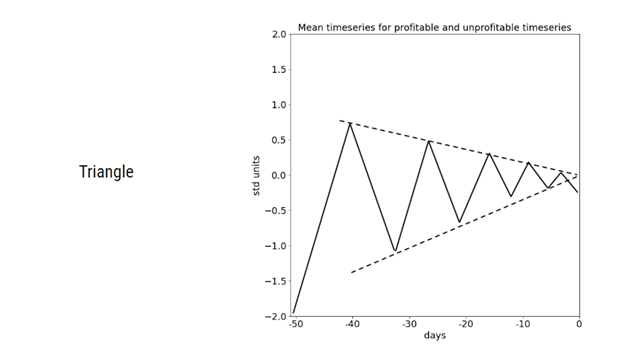
What exactly is a pattern, and what does it look like? Examples of patterns used in technical analysis are seen in Figure 6. Note that these patterns are not unique and small variations still count as the same pattern. More importantly, these patterns exhibit oscillatory behavior as can be seen in Figure 6b.
Now we calculate the cluster centers using the average close price of all time series within a cluster.
Figure 7: Average time series of each cluster. In the left panel, the line width is weighted by the cluster population. In the right panel, the line width is weighted by the cluster’s average potential profit.
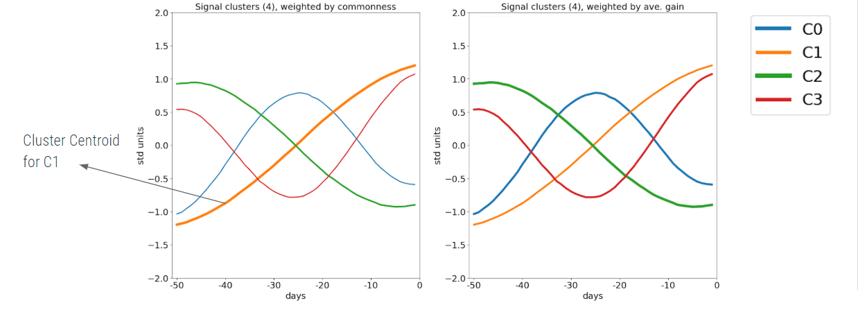
As depicted in Figure 7, monochromatic waves resemble cosine waves of different frequencies. Note that in the left plot of Figure 7, the line widths are weighted by the cluster population, while in the right plot, line widths are weighted by the cluster’s average potential profit. From these plots, we can see that all four clusters have a similar population and that there is very little difference in each cluster’s average potential profit.
As depicted in Figure 7, monochromatic waves resemble cosine waves of different frequencies. Note that in the left plot of Figure 7, the line widths are weighted by the cluster population, while in the right plot, line widths are weighted by the cluster’s average potential profit. From these plots, we can see that all four clusters have a similar population and that there is very little difference in each cluster’s average potential profit.
Figure 8: Average time series of clusters using four different clustering methods.
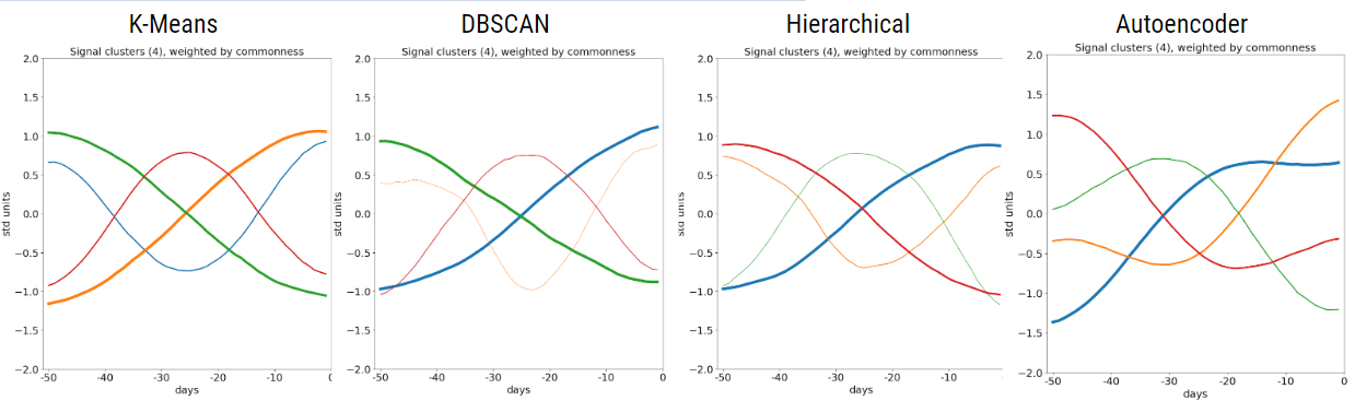
To avoid overfitting to one clustering method, we try several alternate methods. By exploring clustering methods that are different, we avoid algorithms that make the same mistakes and overfit to one particular technique. Now, if the clustering methods return similar results, it lends support to the argument that these patterns indeed characterize the data. As can be seen in Figure 8, K-Means, DBSCAN, and Hierarchical Clustering return very similar patterns. The autoencoder method is slightly different, however, its patterns still appear harmonic and retain symmetry across the x-axis.
To avoid overfitting to one clustering method, we try several alternate methods. By exploring clustering methods that are different, we avoid algorithms that make the same mistakes and overfit to one particular technique. Now, if the clustering methods return similar results, it lends support to the argument that these patterns indeed characterize the data.
As can be seen in Figure 8, K-Means, DBSCAN, and Hierarchical Clustering return very similar patterns. The autoencoder method is slightly different, however, its patterns still appear harmonic and retain symmetry across the x-axis.
Figure 9: Patterns that arise when clustering time series of different lengths. The patterns for the 100-day time series have a noticeable upward slope.
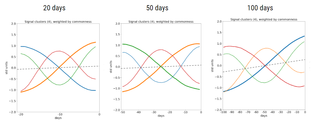
In figure 9, I examine the results when changing the segment length from 50 days to 20 and 100 days. Note that 20 trading days is one month, 50 trading days is approximately one quarter, and 100 trading days is approximately half a year. Figure 9 shows similar patterns in the 20 and 50-day windows, but we see a significant upward slope for the 100-day segment. This upward slope indicates that the stocks we examined, on average, increased in value over the period we considered (1990-2020) on scales of half a year.
In figure 9, I examine the results when changing the segment length from 50 days to 20 and 100 days. Note that 20 trading days is one month, 50 trading days is approximately one quarter, and 100 trading days is approximately half a year. Figure 9 shows similar patterns in the 20 and 50-day windows, but we see a significant upward slope for the 100-day segment. This upward slope indicates that the stocks we examined, on average, increased in value over the period we considered (1990-2020) on scales of half a year.
It’s possible that we obtain harmonic patterns because these clustering methods rely on Euclidean distance to separate clusters. Because sin and -sin are opposite to each other and therefore far apart, it would be a very reasonable way to separate the clusters. We do not see the same patterns when we use the autoencoder--because the time series has been embedded onto a lower dimension, the distance is calculated in a different space. However, the fact that the autoencoder patterns also show oscillatory and symmetric behavior indicates that this is not just an artifact of our clustering algorithms but rather a robust phenomenon.
Next, we tried clustering on multi-channel data. We included open, high, low, and close prices here. Using K-Means and autoencoder methods to cluster the data, I plotted the medoid time-series below in Figure 10. I found that even using multi-channel data, we still get similar results -- classes separated, largely, by opposite-sign harmonics.
Figure 10a: Medoid time series for each cluster using K-Means clustering on multichannel data (open, high, low, and close)
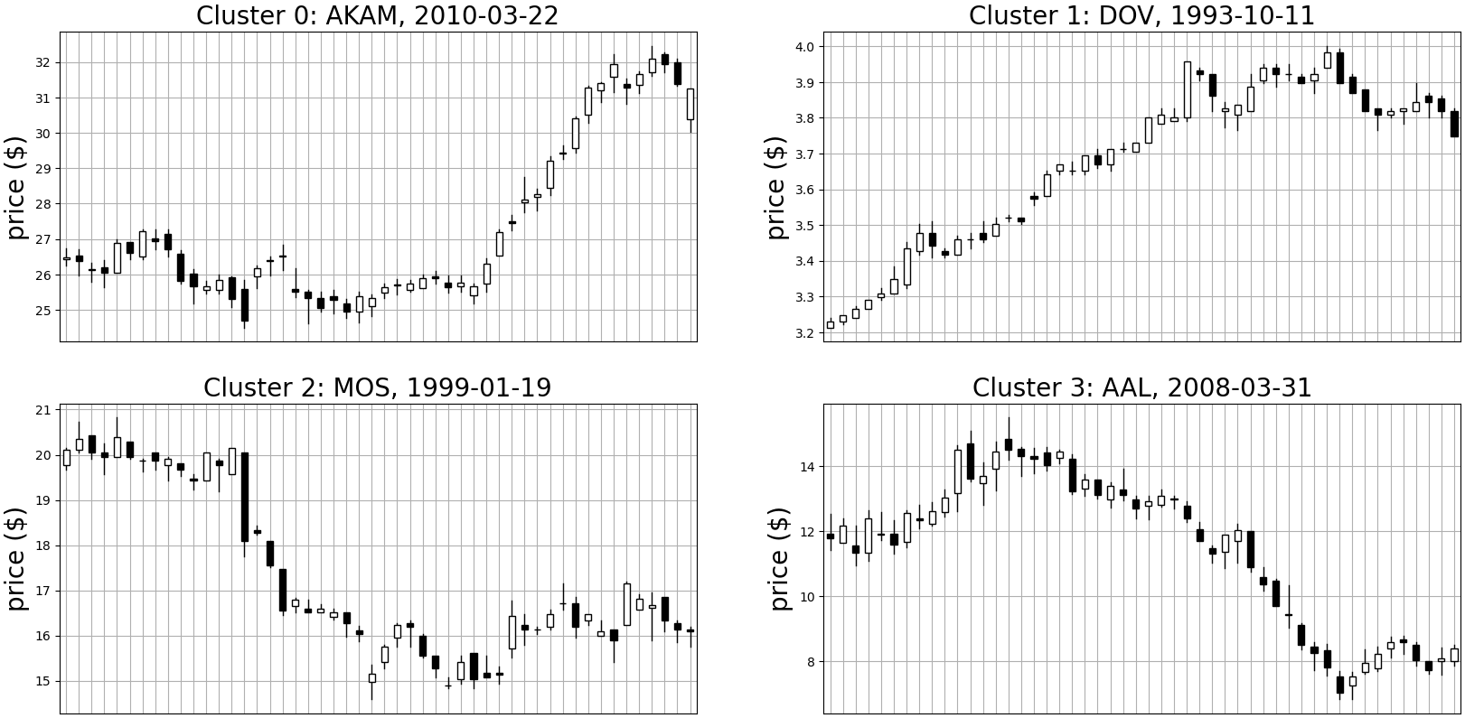
Next, we tried clustering on multi-channel data. We included open, high, low, and close prices here. Using K-Means and autoencoder methods to cluster the data, I plotted the medoid time-series below in Figure 10. I found that even using multi-channel data, we still get similar results -- classes separated, largely, by opposite-sign harmonics.
Figure 10b: Medoid time series for each cluster using the autoencoder method on multichannel data (open, high, low, and close)
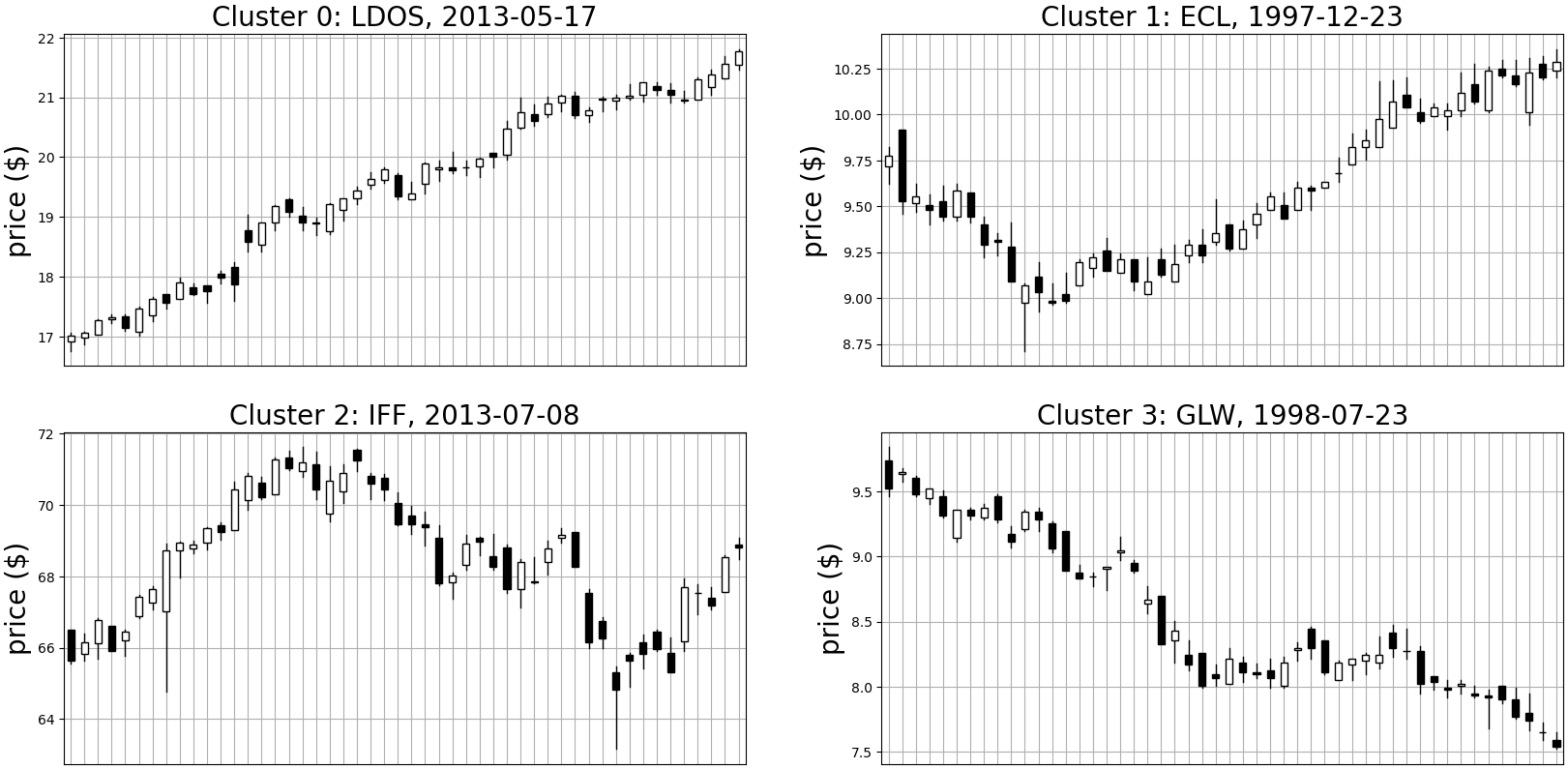
Next, we tried clustering on multi-channel data. We included open, high, low, and close prices here. Using K-Means and autoencoder methods to cluster the data, I plotted the medoid time-series below in Figure 10. I found that even using multi-channel data, we still get similar results -- classes separated, largely, by opposite-sign harmonics.
The final experiment was to cluster and extract the dominant patterns from the data after filtering it according to potential profit and loss. The results are shown in Figure 11.
- The solid-triangle line in Figure 11 shows the standard, randomly-sampled dataset I used before (labeled as “unfiltered”).
- The solid line shows clustering results after filtering the data to include only the profitable segments - random time series with a maximum potential profit between $10 and $100, with a potential loss of no more than $10.
- The dashed line complements the solid by showing the averaged segments after filtering for unprofitable segments -- segments with a potential loss between -$100 and -$10, with a potential profit of no more than $10.
Figure 11: Average time series of each cluster for profitable, unprofitable, and unfiltered time series. Each dataset is clustered separately.
The final experiment was to cluster and extract the dominant patterns from the data after filtering it according to potential profit and loss. The results are shown in Figure 11.
Interestingly, we see almost no difference in cluster centers between the three time-series – unfiltered, profitable, and unprofitable – despite the fact that there is such a large difference in the potential rate of return between the datasets.
Conclusion
The goal of this project was to identify patterns in stock data using semi-supervised learning. We did this by clustering time series of various lengths using different methods and analyzing these clusters.
We observed oscillatory and symmetric patterns across four different clustering methods. These patterns were not good indicators of potential profit or loss.
There are many things I wanted to explore but was unable to, due to time constraints, e.g., using different clustering methods on the autoencoder embedding, or including volume as a channel for multi-channel experiments. An interesting alternative method of finding patterns might be using supervised learning with a convolutional neural network to predict future price/profitability and visualize the convolutional filters. One would essentially be programming an artificial technical analyst and (potentially) identifying emerging chart patterns.
As I mentioned earlier, this project was part of my internship at J.P. Morgan in their AI Research team this summer. In particular, I would like to thank Naftali Cohen, Srijan Sood, and Zhen Zeng for their help and guidance throughout this work. Without their help, this project would not have been so successful. I had an excellent time during this internship and learned a great deal about unsupervised learning and data science from my coworkers.
I hope that you enjoyed reading about this project and that it gave you some interesting insight into machine learning with technical analysis.
Thank you.
Lawrence Huang
Disclaimer
This post was prepared for informational purposes by the Artificial Intelligence Research group of JPMorgan Chase & Co and its affiliates (“J.P. Morgan”), and is not a product of the Research Department of J.P. Morgan. J.P. Morgan makes no representation and warranty whatsoever and disclaims all liability, for the completeness, accuracy, or reliability of the information contained herein. This document is not intended as investment research or investment advice, or a recommendation, offer or solicitation for the purchase or sale of any security, financial instrument, financial product or service, or to be used in any way for evaluating the merits of participating in any transaction, and shall not constitute a solicitation under any jurisdiction or to any person, if such solicitation under such jurisdiction or to such person would be unlawful.
© 2023 J.P. Morgan Chase & Co. All rights reserved